What is StoryBook and should you use it?
A look into a popular tool for building UI components

What is StoryBook
It's a tool for building UI components that promises developers the ability to develop components independently of one another and without the need to have mock data in a database.
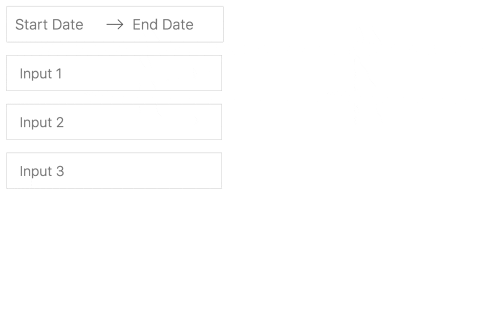 Image showing the different states of an airbnb calendar component in StoryBook [1]
In practice this means no need to spin up a local development environment, nor jump through hoops such as log in, select an option, click that button, just to see the real version of a component and all the states it can have.
Storybook accomplishes this using stories and story args, where a story is, well, a story of all the rendered states a component can have. While args are how we pass data to a component in a story without the need for a database or jumping through hoops
Furthermore, Storybook works with the major frontend libraries like React, and Vue, as well as frameworks like Angular.
Why read this
As a developer I've experienced the pain of having to work with React components which should have separate concerns getting so entangled together they become impossible to make changes to without breaking one another. As well as very hard to compose using one without needing the other. So when I first heard of Storybook I immediately wanted to check it out!
However, I never got around to setting it up for use in a project because the getting started curve always seemed a bit too much for my time constraints.
Now, I've finally decided to check it out by following it's documentation and tutorials, and to share the opinion I form on its usefulness for other developers who've still not had time to check it out themselves.
The Getting Started Curve
Getting started took about as long as I always thought it would... about 30 - 40 minutes.
Installation
The actual installation, which is really only designed to work within an existing project, takes maybe 5 - 10 minutes, and the rest of the getting started time is spent absorbing the concepts and design principles behind Storybook.
Design Principles Behind StoryBook
Storybook's core principle is component driven design, and I encourage anyone who's unfamiliar with this principle to have a look at the resource[4] they provide for it.
Component driven design is not a new concept in software engineering nor front-end development, and it certainly wasn't invented in 2017 [2].
HTML itself for instance is basically a bunch of components which get composed to form larger components. While React's core principle of composition rests on component driven development [3].
Yet, there is value in checking out the resource they provide to see how the concept of component driven development is made explicit. Discouraging the idea of looking at the building blocks of websites as pages, and instead making it clear that front-end building blocks are much smaller.
It should leave you encouraged as a developer to ask [of components] is this the smallest building block to this new component I want to create.
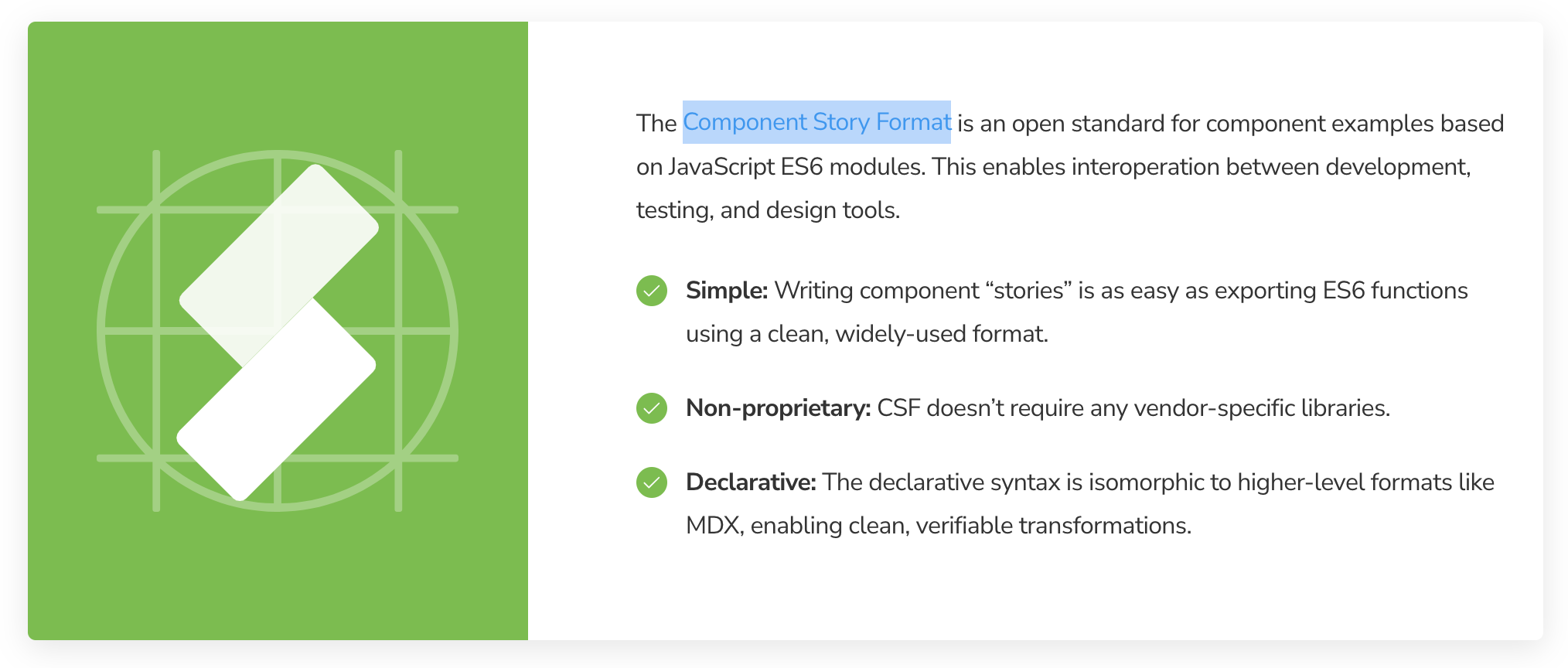
As well as informed of the existence of the Component Story Format, which is the recommended way to write the stories used in Storybook
Is Storybook Useful
I think it depends on what you or your organisation needs. On whether the relevant project
- requires building its own component library,
- converting a custom design system to a component library,
- using an existing open source component library,
- possibly requires building on top of pre-existing components,
- or definitely does not require building any new components.
Having time bound myself to go through just the introductory section of the StoryBook documentation and spin up a simple component, it's unrealistic to say I've formed a correct opinion on StoryBook's usefulness,
however, here is my opinion, formed from exploring the showcase projects on StoryBook, and going through accounts from people who've used it.
StoryBook is probably not useful for the vast majority of front-end developers who rely on pre-existing component libraries with little to no new complex component development being done.
The showcase projects I saw using StoryBook had used it to effectively document what seemed like their entire component libraries. Audi, Capgemini, Codecademy, and Shopify. These companies created a space for front-end developers using their component libraries to see what components are available and how they should look in all their relevant states.
So unless you're building your own component library and want a way to do something similar, or you've already built your first 1 - 3 new components which you want to document and ensure have clear separation of concerns, and think you'll still need to build more, you probably don't need StoryBook.
However, it's definitely a tool I'll see myself including in my project if there's ever uncertainty about whether or not I'll be needing to build new components, just so that it's set up and ready to go as a replacement for the all too common components folder.
Conclusion
Use StoryBook if your project:
- requires building its own component library,
- converting a custom design system to a component library,
- or possibly building on top of pre-existing components from open source component libraries.
Don't bother if your project:
- will limit itself entirely to an existing component library.
All that said, happy coding 🥳
Attribution
Cover image from uxpin